What Is Mobile-First Design and Why It Matters in 2025
By Aj Khandal | Published: | 3 min read
In a world where over 60% of internet traffic comes from smartphones,
designing for mobile isn’t optional—it’s essential
. As we step into 2025, users expect websites to load fast, look great, and function seamlessly on mobile devices.
That’s where
mobile-first design
comes in. In this blog, you’ll learn what it is, why it matters more than ever, and how it can transform your website
performance and conversion rates.

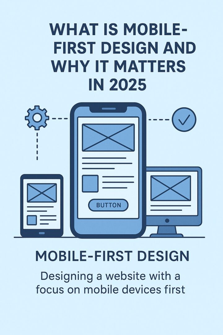
What Is Mobile-First Design?
Mobile-first design
is a web development strategy that starts by designing your website for the smallest screens—typically smartphones—and
then scales up for tablets and desktops.
This approach flips the traditional model. Instead of building a desktop site first and “shrinking it down,”
mobile-first ensures your site is:
-
Fast
-
User-friendly
-
Prioritized for mobile UX
It’s based on
progressive enhancement
—you begin with core content and functionality, then layer on enhancements for larger screens.
Why Mobile-First Design Matters in 2025
1. Google Prioritizes Mobile UX
Google uses
mobile-first indexing
, meaning it evaluates the mobile version of your website first when ranking it in search results.
If your site doesn’t perform well on mobile, your SEO suffers—even if your desktop version is flawless.
Related:
7 Essential WordPress SEO Plugins to Boost Your Website’s Visibility
2. Mobile Users Have Higher Conversion Intent
Mobile users are often on the move—looking for quick answers or ready to take action (like buying or calling). A
mobile-first design can:
- Reduce bounce rates
- Improve CTA engagement
- Increase leads and sales
3. Speed = Revenue
Studies show that
53% of users abandon sites that take more than 3 seconds to load.
Mobile-first design emphasizes lightweight assets, smart content loading, and device-optimized visuals.
Tip: Combine this with
lazy loading, responsive images
, and
mobile caching.
4. Better UX, Better Brand Perception
A slow, clunky mobile site damages trust. A clean, intuitive mobile layout gives users confidence and helps build brand
authority.
5. Future-Proofing for Wearables & Emerging Devices
With wearables, foldables, and smaller form-factor tech on the rise, mobile-first design prepares your site for
device fluidity
in 2025 and beyond.
Mobile-First vs Responsive Design: Are They the Same?
Not exactly.
| Responsive Design |
Mobile-First Design |
| Adapts from desktop down |
Starts from mobile up |
| Often bloated with unnecessary elements |
Strips down to essentials |
| May prioritize visual design first |
Prioritizes content and UX |
Mobile-first is a
mindset and a strategy
—not just a layout adjustment.
How to Implement Mobile-First Design (Tips)
Need a mobile-first website?
Let’s talk
Real Examples of Mobile-First Wins
Clients who adopted mobile-first strategies on WordPress saw:
These changes didn’t just improve design—they improved results.
Final Thoughts
In 2025,
mobile-first is not a trend—it’s a standard
. If you’re building or rebuilding your website, make sure it’s designed with mobile users as your primary audience.
Whether you’re a solopreneur, coach, or startup founder—your mobile experience is
your first impression
.
Book a free consult
to audit or design your mobile-first website.