What Is Mobile-First Design and Why It Matters in 2025
In a world where over 60% of internet traffic comes from smartphones, designing for mobile isn’t optional—it’s essential. As we step into 2025, users expect websites to load fast, look great, and function seamlessly on mobile devices.
That’s where mobile-first design comes in. In this blog, you’ll learn what it is, why it matters more than ever, and how it can transform your website performance and conversion rates.
What Is Mobile-First Design?
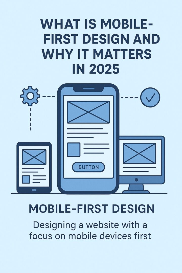
Mobile-first design is a web development strategy that starts by designing your website for the smallest screens—typically smartphones—and then scales up for tablets and desktops.
- Fast
- User-friendly
- Prioritized for mobile UX
It’s based on progressive enhancement—you begin with core content and functionality, then layer on enhancements for larger screens.
Why Mobile-First Design Matters in 2025
1. Google Prioritizes Mobile UX
Google uses mobile-first indexing, meaning it evaluates the mobile version of your website first when ranking it in search results.
2. Mobile Users Have Higher Conversion Intent
- Reduce bounce rates
- Improve CTA engagement
- Increase leads and sales
3. Speed = Revenue
Studies show that 53% of users abandon sites that take more than 3 seconds to load.
Mobile-first design emphasizes lightweight assets, smart content loading, and device-optimized visuals.
4. Better UX, Better Brand Perception
5. Future-Proofing for Wearables & Emerging Devices
With wearables, foldables, and smaller form-factor tech on the rise, mobile-first design prepares your site for device fluidity in 2025 and beyond.
Mobile-First vs Responsive Design: Are They the Same?
| Responsive Design | Mobile-First Design |
|---|---|
| Adapts from desktop down | Starts from mobile up |
| Often bloated with unnecessary elements | Strips down to essentials |
| May prioritize visual design first | Prioritizes content and UX |
Mobile-first is a mindset and a strategy—not just a layout adjustment.
How to Implement Mobile-First Design (Tips)
Real Examples of Mobile-First Wins
Clients who adopted mobile-first strategies on WordPress saw:
These changes didn’t just improve design—they improved results.
Final Thoughts
Whether you’re a solopreneur, coach, or startup founder—your mobile experience is your first impression.
Book a free consult to audit or design your mobile-first website.